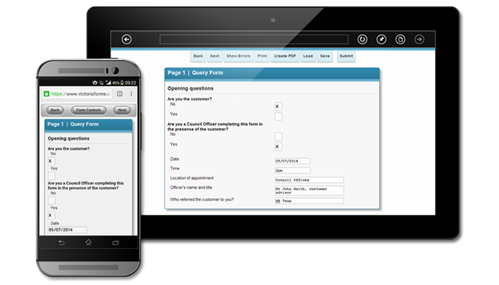
Online eForms for data collection:
Victoria Forms pioneered the first eForm technologies in 2003, which enabled professional forms to run in unmodified browsers – making eForms easily accessible to everyone and broadening eForm possibilities for professional applications.
We have continually developed this software to create a complete solution for everyone. Our forms blend seamlessly into existing websites and have a host of intelligent features hidden behind the scenes to enhance the user experience.
Blank form templates are created within our forms design software suite. Without modification, created forms can be deployed to the internet, and opened within all modern browsers, intuitively resizing to fit screen sizes on both desktop pcs and laptops, as well as mobile and tablet devices.
eForms can be presented in a number of different ways – in a modern web format, or in a specialist format that exactly matches the layout of traditional paper forms.
eForms are optimised for whatever device they are being completed on. Users opening forms on a smart phone are automatically redirected to a smart phone version of the form that adapts to fit to the screen size of the device.
Within smart phone versions of eForms –
- Form pages have a simpler layout with questions and text in a single vertical column
- There is no horizontal scrolling – the complete form page can be seen by scrolling from top to bottom
- The form control interface is simplified, to maximise the use of the limited screen space available
- The code is optimised to be as responsive as possible
Our internet forms don’t require a continuous network connection. When first opened, all form pages are downloaded and stored in the device’s memory. As the user moves from page to page, these are retrieved from the device and not from the server.
The advantages of this unique approach include:
- Ultimate reliability – eForms work, unhindered by broken internet / mobile data connections
- Fast completion – there is no delay as the user moves from page to page of the form
- A single server can deal with hundreds of users filling in forms simultaneously. The server remains idle, right up to the point where the user submits the form, reducing hosting costs
We have worked directly with our customers, implementing their feedback into every step of our product development. Our recent redevelopment of the look and feel of Victoria Forms’ eForms enables organisations to control almost every aspect of the presentation of their eForms, including the appearance of the control toolbar. As a result of this improved eForms styling, eForms are not only consistent with corporate website styles, but are also more appealing to the target users completing them.
Data types and field restrictions – The software forces data to be entered in the appropriate way for the specific question, e.g. text, dates and checkboxes. The software prevents users entering excess data into a field which would otherwise overflow, causing text to be scrolled out of sight. This feature prevents data being entered which would then fail to appear on the printed and electronic document version of the form. This streamlines the form data for organisations, improving efficiency by reducing time spent correcting errors manually.
Drop down lists – two types are available – a fixed list, and a combo box. In the latter, which has not previously been possible with conventional internet forms, the user can make a choice from a list, or enter their own choice.
Calculations – automatic calculations improve user experience by allowing the input of ‘simple’ data which is used to calculate the final answer required. This is especially beneficial for financial predictions or instantly calculating someone’s age based on their date of birth. Automatic Calculations can also be used to generate personalised messages based on user input, allowing full customisation of eForms. A library of over 100 functions can be used to handle both number and text manipulation
Form Consolidation – The form monitors answers provided and instantly turns questions on or off, preventing the user from answering questions that are not applicable to their case. Whole pages and sections of a form can be hidden from the user, streamlining the form to minimise errors, improve efficiency and enhance user experience.
Help information – just like a paper form, eForms can contain help information throughout. Sparing use of colours and bold fonts draw the user’s attention.
Potentially difficult form questions can be supported with intelligent form-level help:
– Guidance messages can appear on screen
– Help can appear as a popup message when clicking on a help icon beside the field
Users can move from field to field and page to page quickly using the Tab key. This allows users on traditional devices to work their way through the form using the keyboard only. Users can move from one relevant question to the next, jumping over questions and pages that are not relevant to their case.
The sequence of questions through the form can be set to mimic the most natural route a real interview session would be likely to take. The result is almost like a script, leading users assisting others to complete the form from one question to the next.
Error checking is not always forced on the user as they complete the form. Users can leave answers and sections blank, and come back to them later, if ‘Forced Error Checking’ is not enabled. Whilst completing the form, the user can select the show errors button which prompts the software to scan through the form and check for mistakes and omissions, reporting to the user with a count of errors on each page and highlighting any errors on the current page to be quickly corrected. The form cannot be submitted until incorrect answers have been revised, ensuring increased reliability of information.
Our forms can check for mandatory fields left empty, as well as more advanced checks, such as inconsistent dates, incorrectly formatted National Insurance numbers, invalid email addresses, etc.


